Note
I wanted my Fitbit stats on my Pebble. So we built Health Glance.
Building Health Glance with Cursor: getting Fitbit data onto my Pebble, testing in two emulators, and learning why a simpler watch app was the better answer.
I have a Pebble Time 2 and a Fitbit Air. I wanted the Fitbit to do the tracking, and the Pebble to show me the useful bits. Steps, sleep, heart rate, my last workout. Nothing particularly outrageous.
I wasn’t using Pebble’s own fitness tracking. I just wanted to press a button and see the data I already had, in something that felt like it belonged on the watch.
So I opened Cursor and started building. Or, more accurately, started a fairly long conversation about what we should build, why it didn’t look right, and why it had just run out of memory again.
The result is Health Glance: a small Android companion and a Pebble watch app. Getting there was the interesting part.
First: can we avoid another Android app?
That was one of my first questions. I hadn’t done Android development before this, and a companion app felt like another thing to build and maintain.
The initial approach used a Cloudflare Worker and the Google Health API, with PebbleKit JS bridging the data to the watch. It was a reasonable personal experiment: my setup, my authentication, my stats.
But then I started thinking about sharing it. I didn’t want someone else to need their own little cloud project just to see their steps.
That changed the architecture. The shareable version reads Health Connect on the Android phone, then pushes the stats to the paired Pebble through PebbleKit. Fitbit is one possible source; another app can work too, provided it actually writes the relevant records into Health Connect.
The companion path reads on-device and sends to the watch. It doesn’t need my Worker or a Google refresh token. The old cloud experiment is still in the repository, explicitly marked as personal reference rather than part of the product.
It also explains the name change. Fitbit Glance was a bit too specific once the app wasn’t really Fitbit-specific any more.
I wanted a testing loop, not a pile of generated code
Before we built the Android side, I asked for the same thing I’d wanted on the Pebble side: an emulator and a loop the agent could drive.
Build it. Install it. Open it. Look at the screen. Read the logs. Fix it. Do it again.
On the watch side, that meant the Emery emulator for Pebble Time 2, sample data, button navigation and screen captures. On Android, it meant an Android Virtual Device, ADB, Gradle, Health Connect and a debug-only data seeder.
The companion’s loop could install the APK, launch the app, seed sample records, capture a screenshot and collect logcat output. That gave us a repeatable way to exercise the data-reading path without waiting for me to go for a walk or have another night’s sleep.
There were limits. Permissions and pairing still needed attention. The Android emulator could prove that the companion read the seeded records, but it couldn’t prove the Bluetooth journey to a real paired Pebble. An expected “Core Pebble not reachable” wasn’t the same thing as a successful watch sync.
So we tested those pieces separately, then moved to the real phone and watch for the actual handoff.
At one point I went out with both devices and asked Cursor to keep iterating in the emulator while I was away. That’s the useful version of autonomous development for me: give it a feedback loop it can actually observe, rather than asking it to declare its own work finished.
The mockups were lovely. The watch had other ideas.
We explored quite a lot: weekly charts, hourly steps, sleep detail, heart-rate views, drill-downs, different visual styles.
I wanted something native to Pebble, not a phone dashboard squeezed onto a tiny screen. I also wanted it to be legible outside. Big numbers, proper spacing, a bit of personality.
Those requirements sound compatible until you’re looking at a watch and everything is either too small or crashing.
There were repeated “Alloy: fatal error, memory full” moments. A design that looked great in a browser wasn’t automatically a design that would survive on the watch. Fonts, extra views and the data arriving from the companion all had to live within the same constrained environment.
I kept asking for consistent padding, bolder type and screenshots compared against the mockups. I also kept asking why the thing still crashed.
Eventually the more useful question was: are we trying to show far too much?
Four cards was the better answer
The app settled into a much simpler deck:
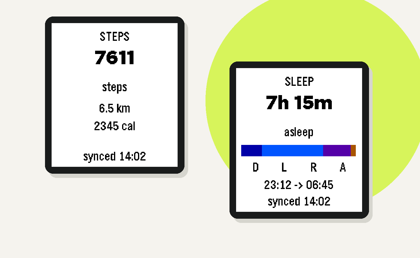
Steps, with distance.
Sleep, with phases and start/end times.
Heart, with resting, minimum and maximum heart rate.
Workout, with the most recent session and its available stats.
Not every possible metric. The things I actually wanted to glance at.
The buttons mattered too. I’d assigned Up as the quick-launch shortcut, so pressing Up should open Steps, and pressing Up again should continue through the cards. Down from Steps should take me back out. The first implementation got that backwards, which is exactly the sort of thing that becomes obvious on your wrist.
We tried side indicators, then removed them because they were getting in the way. Animations were discussed and explored in mockups, but I chose to leave them out of that implementation pass. Readable, consistent and reliable came first.
I liked the big type and colour in Pebble’s timer app, but didn’t want a literal copy. That distinction needed explaining more than once: borrow the design language, not the whole design.
Please don’t show me pretend steps
Another thing that annoyed me: opening the app and seeing dummy numbers before the real sync arrived.
Sample data is useful in an emulator. It’s not what I want on my wrist.
The simpler app gave us room to revisit caching properly. Now it keeps a tiny last-known snapshot on the watch, paints that immediately, then asks the phone for an update. We also trimmed the companion payload to what the minimal interface actually uses.
The cache test had its own wrinkle: restarting the emulator wiped its flash state. We had to preserve the running emulator between seeding and reopening to test the behaviour we actually cared about.
Background refresh stays on the phone. WorkManager periodically refreshes the companion’s cache; that doesn’t mean a closed watch app is continuously receiving updates. I’d rather be clear about that than pretend “background sync” is one magical feature.
Sharing the thing that already works
My brief for sharing it was pretty straightforward: this works for me; make it easy for other people to grab, without turning it into another huge project.
The repository has the source and links to the Android APK and Pebble PBW downloads. It’s currently an Android sideload route targeting Pebble Time 2, not a claim of support for every Pebble or a finished Play Store launch.
What I like about this project isn’t that AI produced an app in one prompt. It didn’t. There were wrong turns, overcomplicated screens, memory errors, awkward navigation and plenty of me saying “hrm, no”.
What made it useful was being able to keep moving between an idea, a mockup, a running emulator and the actual watch. Cursor could do a lot of the building and checking. I still had to decide what was worth building, and whether the result felt right.
I wanted my Fitbit stats on my Pebble. The app got better when we stopped trying to put absolutely everything there.
Cover: custom editorial artwork using actual Emery emulator captures from development. The displayed figures are sample data, not my health readings or a promise of the current release’s exact appearance.